
Bringing clustering logic to retail floor maps
 ROLE
- Product Design Intern
 TIMELINE
- Summer 2026 (11 Weeks)
 TEAM
- Dan Reineberg (Manager)
- Radua Nazir (Mentor)
OVERVIEW
Utilizing RFID technology to give retailers 99% accurate, real-time visibility into where their products are.
Radar sensors are deployed in more than 1,400 stores with leading retailers. Radar helps stores improve inventory accuracy, fulfill online orders more reliably, and enable store teams to spend less time searching for products and more time serving customers.
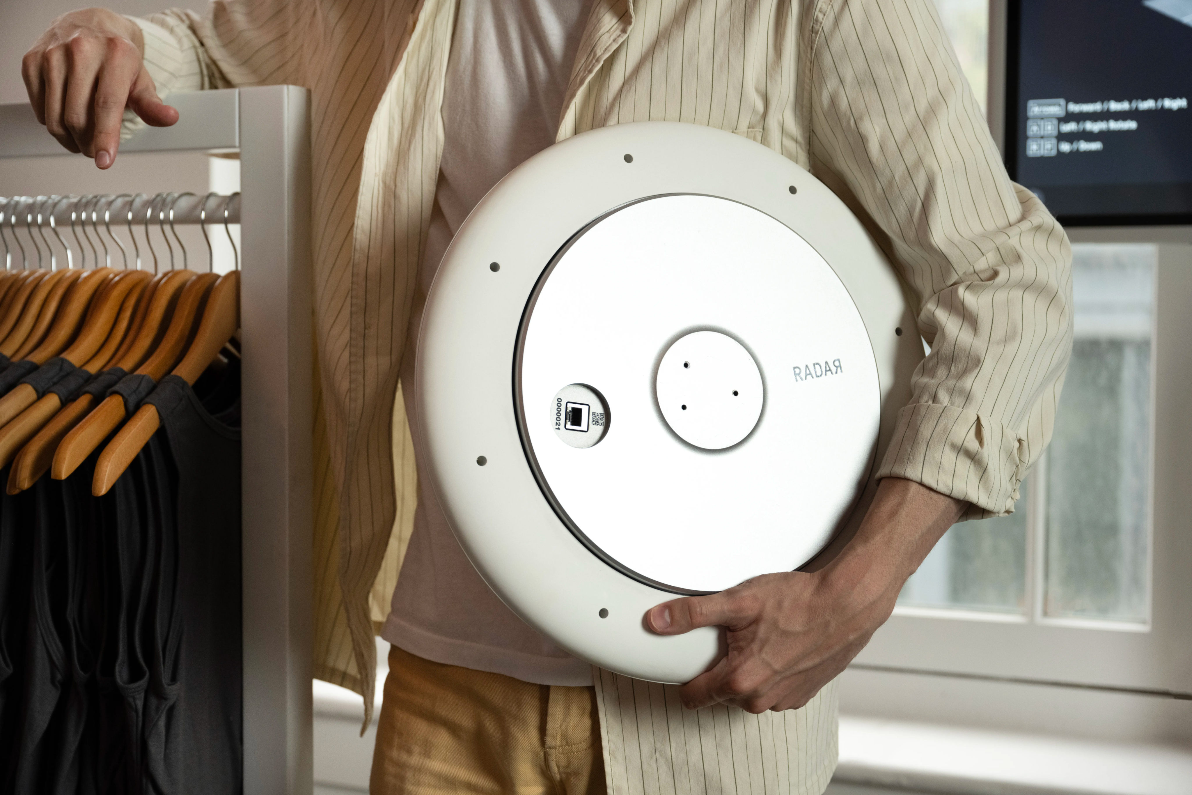
As the first ever product design intern, I worked on multiple features for the Radar Core mobile app used by thousands of store associates. This case study covers 1 of the 3 main projects I worked on over the summer.
PROBLEM
Units of the same product share a home zone
In stores, multiple units of the same product are displayed together—for example, the same shirt would be hung on the same rack.
On the map, those shared locations become overlapping dots, negatively impacting cognitive load and accessibility
The Radar Core app represents each unit as a dot. When units sit close together, their dots overlap, making it difficult for associates to see how many items are in a group or select an individual unit.
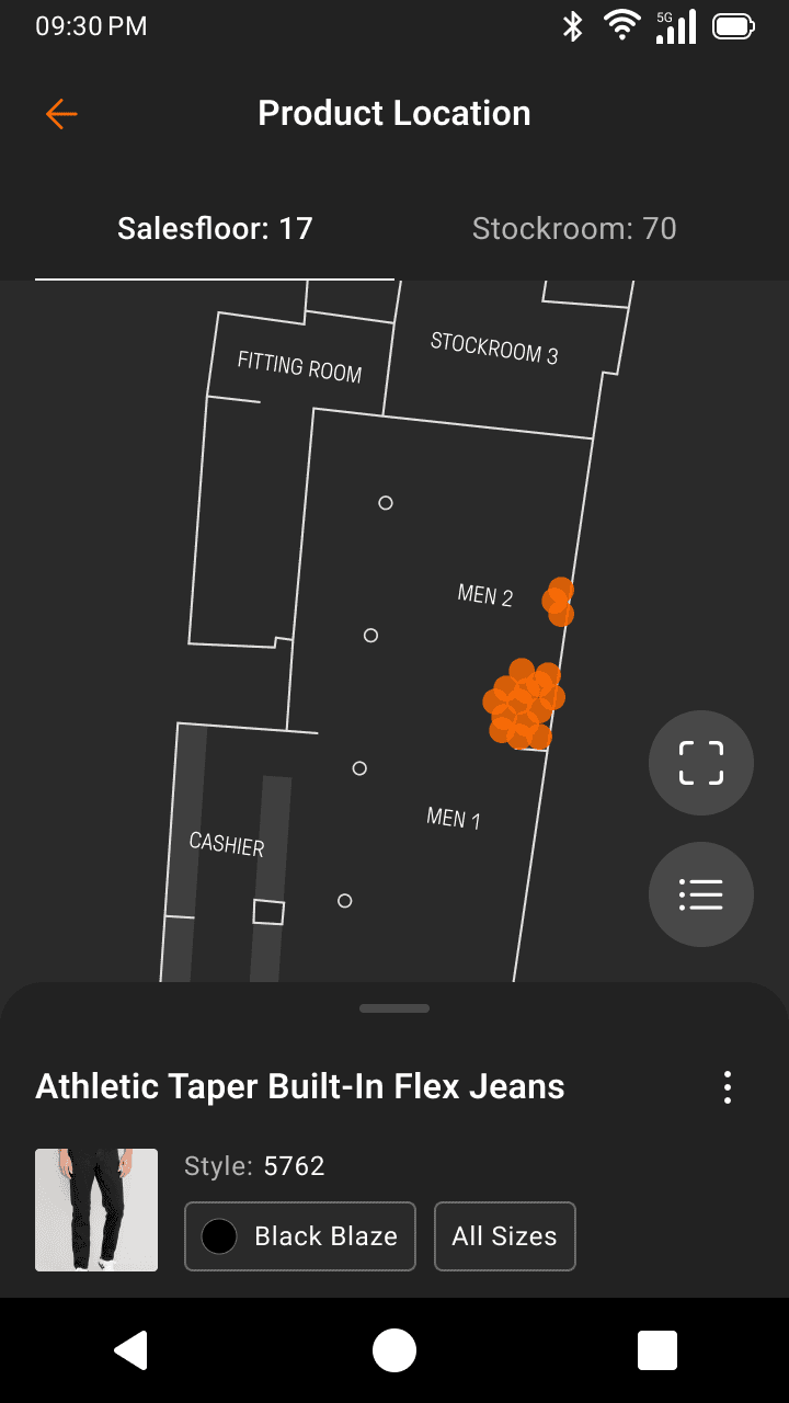
What seemed like a simple fix took three rounds of iteration, shaped by both UX considerations and engineering constraints...
BACKGROUND
We first have to understand how product identifiers break down
A single product spans many SKUs, and every SKU spans many individual units, each with its own unique EPC. This distinction matters because a lot of the design decisions below hinge on it.
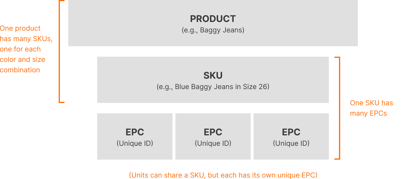
EPCs sit at the bottom of this hierarchy, meaning they're the most granular, specific identifier.
EXPLORATION 1
Surfacing list of EPCs in the bottom sheet
Going into designing this feature, I assumed store associates would want to locate a specific unit.


However, this doesn’t align with real user behaviors
Since I couldn't speak directly with store associates at Old Navy and American Eagle, I talked someone on Radar’s CX team, who works directly with these stores and understands how the product is actually used by associates.

“[Store associates] rarely look for a specific EPC, they just want to know the general location of a SKU.”
EXPLORATION 2
Surfacing SKUs before EPCs
In my second iteration, SKU cards surfaced first, matching what associates actually needed, while still letting them drill into individual EPCs if they wanted to.
Additionally, to increase screen real estate, tapping into a cluster now opens a new page instead of an just the overlay. The map behind it becomes irrelevant at that point because once a user taps in, they already know the cluster's general location.
However, keeping the bottom sheet invites users to filter
While this new iteration aligns more with real user behaviors, two software engineers brought up a concern: what happens when a user filters a list while inside of a cluster?
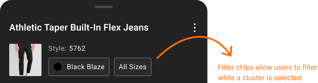
If a user filters while inside a cluster, they could filter down to a SKU or EPC that isn't there, leaving nothing to show.
How might we solve this filtering problem?
We had two options: limit filters to only what exists in the cluster, or remove filtering inside a cluster entirely by introducing a static header.
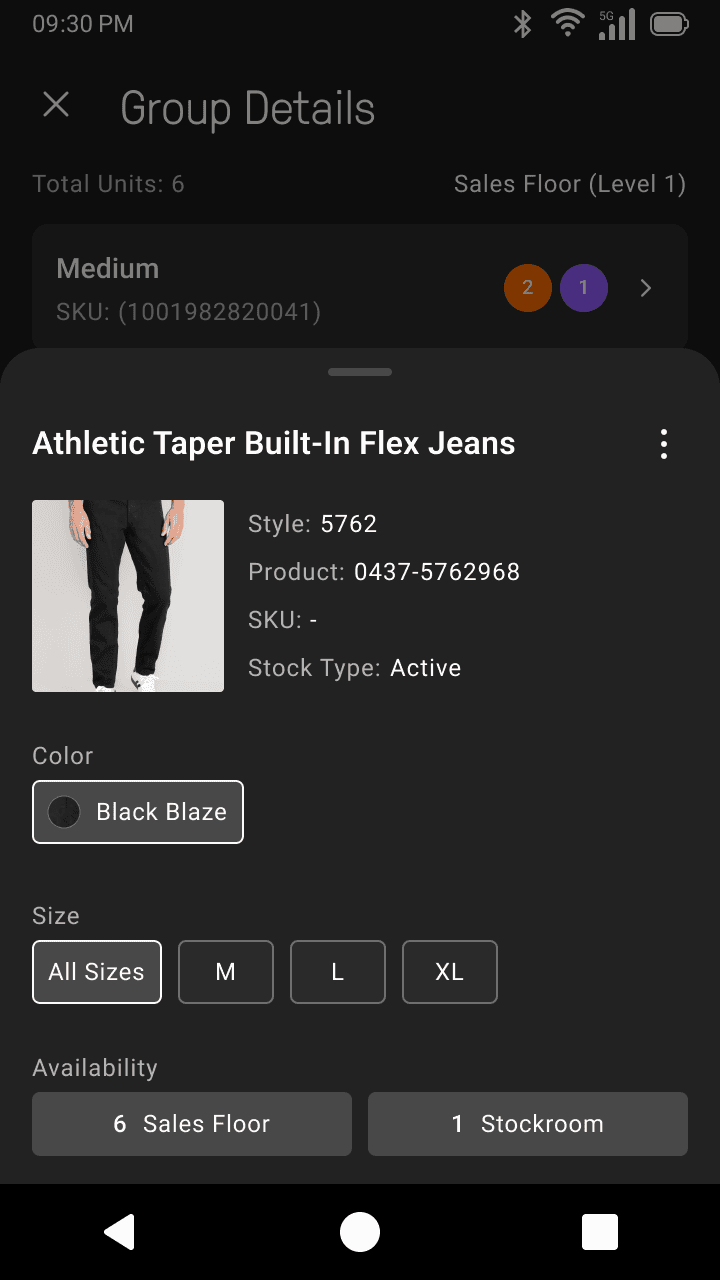
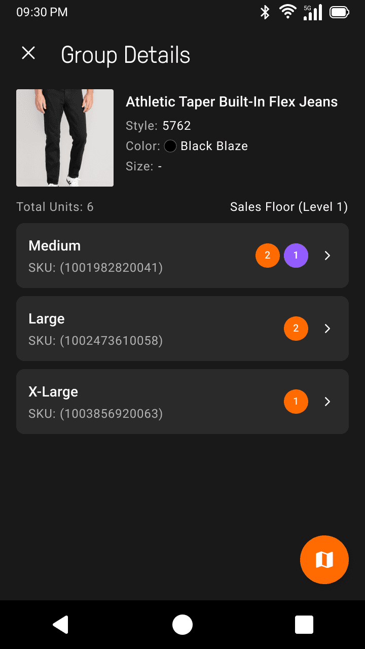
I ultimately decided to remove filtering entirely because tapping into a SKU card is already a form of filtering, so keeping both would be redundant.
SOLUTION
Final flow that was handed-off to engineering and shipped
CONSIDERATIONS
There were a lot of intentional design decisions made after careful communication with engineers
#1: Color segments show presence, not proportion
Each color represents a distinct state (like available or on display), but segments are always sized equally. This was a deliberate design decision because on low-resolution TC52 devices, a proportional segment could be so small that it almost becomes invisible to the human eye.
#2: Data freezes when a user enters a cluster
On the primary map view, a unit’s location is automatically refreshed every second, giving users a live view of the movement of units. However, once a user taps into a cluster, the movement data freezes and refreshes once the user exits the cluster list.
#3: Clusters resolve by zoom level
Zooming out merges nearby clusters together, while zooming in breaks them apart. There's a max zoom in either direction, so a cluster can split into smaller ones, but never all the way down to individual units.
REFLECTION
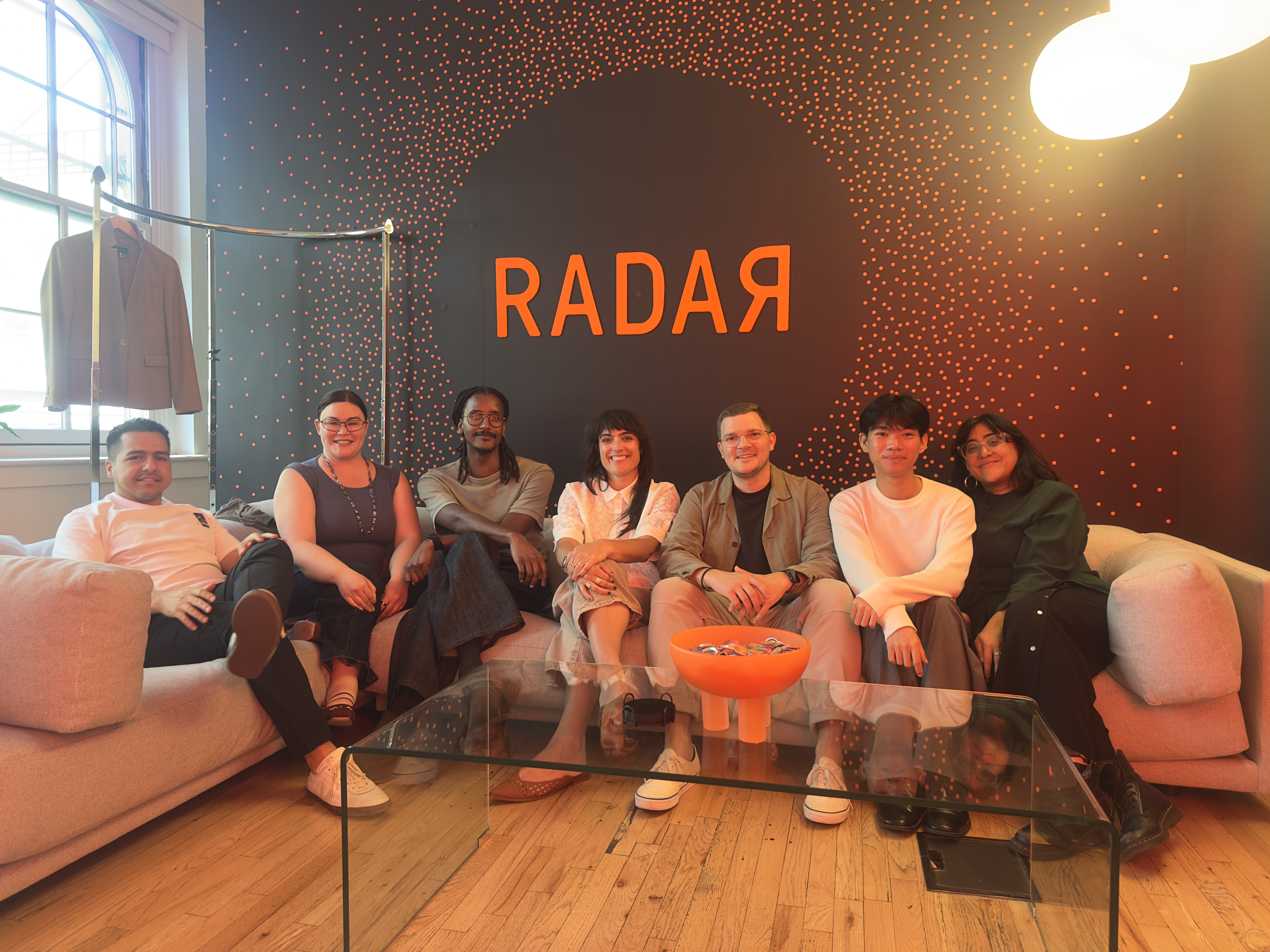
Thank you to my friends at Radar!
This summer was full of growth I couldn’t have imagined, both professionally and personally. I’m excited to bring what I learned in New York back to California!
Key takeaways
Leveraging AI in my design workflow
This summer was the first time I integrated Claude into my design process by building live prototypes, iterating faster, and synthesizing research. It changed not just how fast I work, but how I think about the role of AI in design.
The simplest design challenges hold lots of complexity
I went into this project thinking it was going to be a quick design sprint, but along the way I discovered so many complexities that made the design process more challenging, but way more fun.