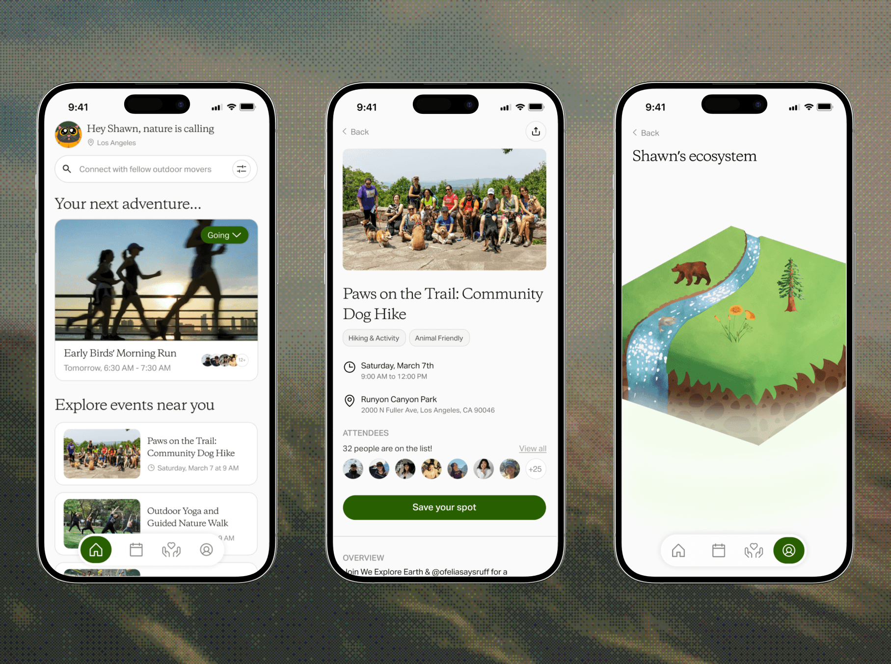
0 → 1 event registration app for 20,000+ users
 ROLE
ROLE- Product Designer
 TIMELINE
- Winter - Spring 2026
 TEAM
TEAM- 4 Product Designers
- 8 Software Developers
- 3 Product Managers
CONTEXT
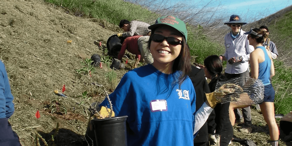
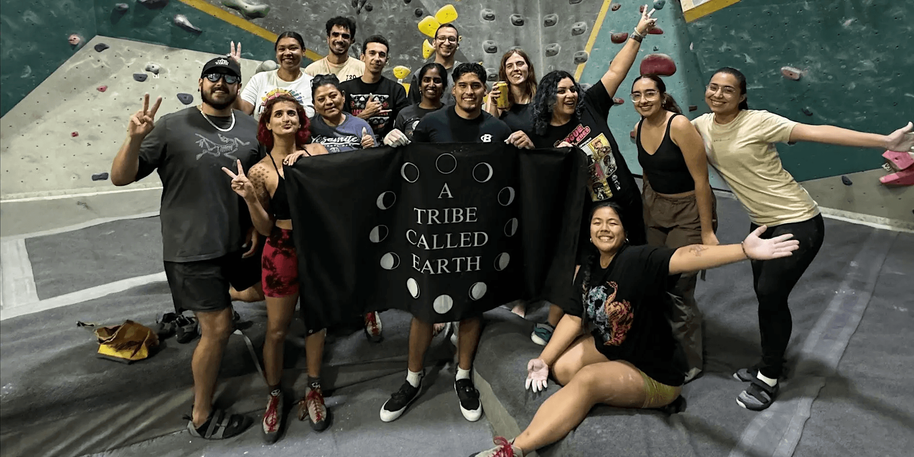
We Explore Earth is a volunteer-powered 501(c)(3) nonprofit organization that hosts 22+ events per month for 20,000+ individuals.
Through free outdoor recreation, environmental education, conservation, and wellness experiences, We Explore Earth is dedicated to improving physical and mental well-being, strengthening communities, and protecting our public lands by making the outdoors accessible to everyone.
PROBLEM
The current event registration experience lives on Eventbrite, which fails to embody the We Explore Earth brand and mission.
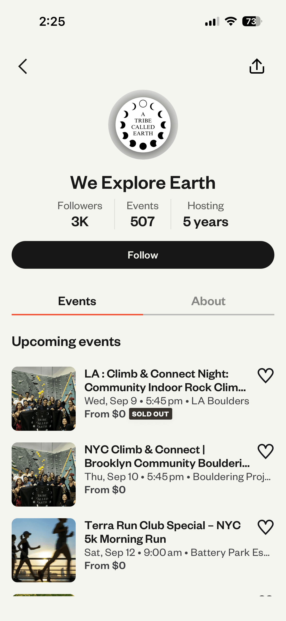
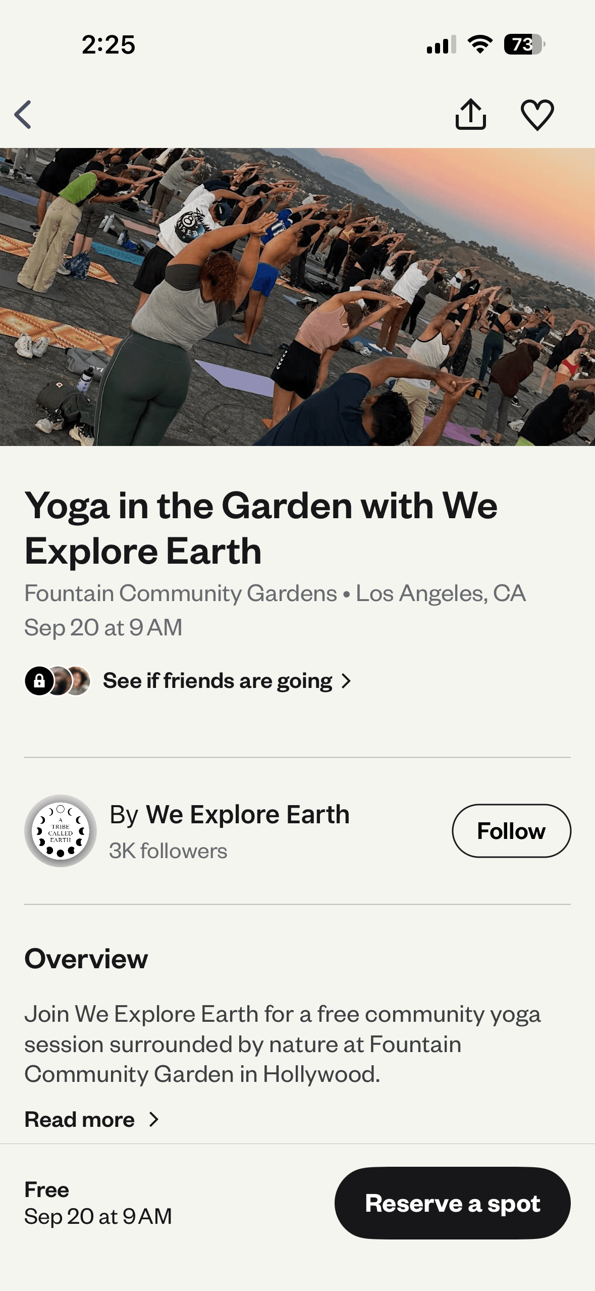
While using a third-party platform works functionally, it didn’t allow our stakeholders to have full autonomy over the user experience, and left attendees with no way to meaningfully connect beyond in-person events.
The founder wanted to build a mobile app that captures the warm, welcoming feeling of the nonprofit.
SETUP
Prioritizing features across iterative deployment
Based on the different features our stakeholders wanted in this app, we separated our design process into two individual phases. Since event discovery and registration were the highest priority for our stakeholders, we made a deliberate decision to fully design and handoff V1 before beginning to design V2 features.
V1
MVP with main event discovery and registration features for deployment
V2
Social and gamification features for conceptual design exploration
RESEARCH
Understanding the current market of our core features
Now that we know what features need to be designed, we took a look at popular apps with similar features across event registration, social media, and gamification. This analysis helped us identify key flows that suggested features to incorporate in our product, as well as things to avoid.
Partiful

 Events feel customizable
 Mainly invitation-based
Luma
Event discovery is easy
Limited personalization

Intuitive social feed
Less safe for young audiences
Strava

Community-oriented
Features behind paywall
Mapping the opportunity space
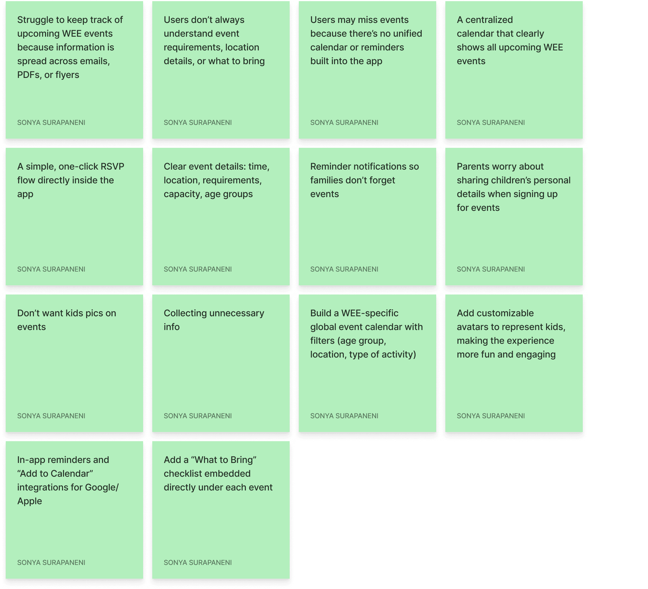
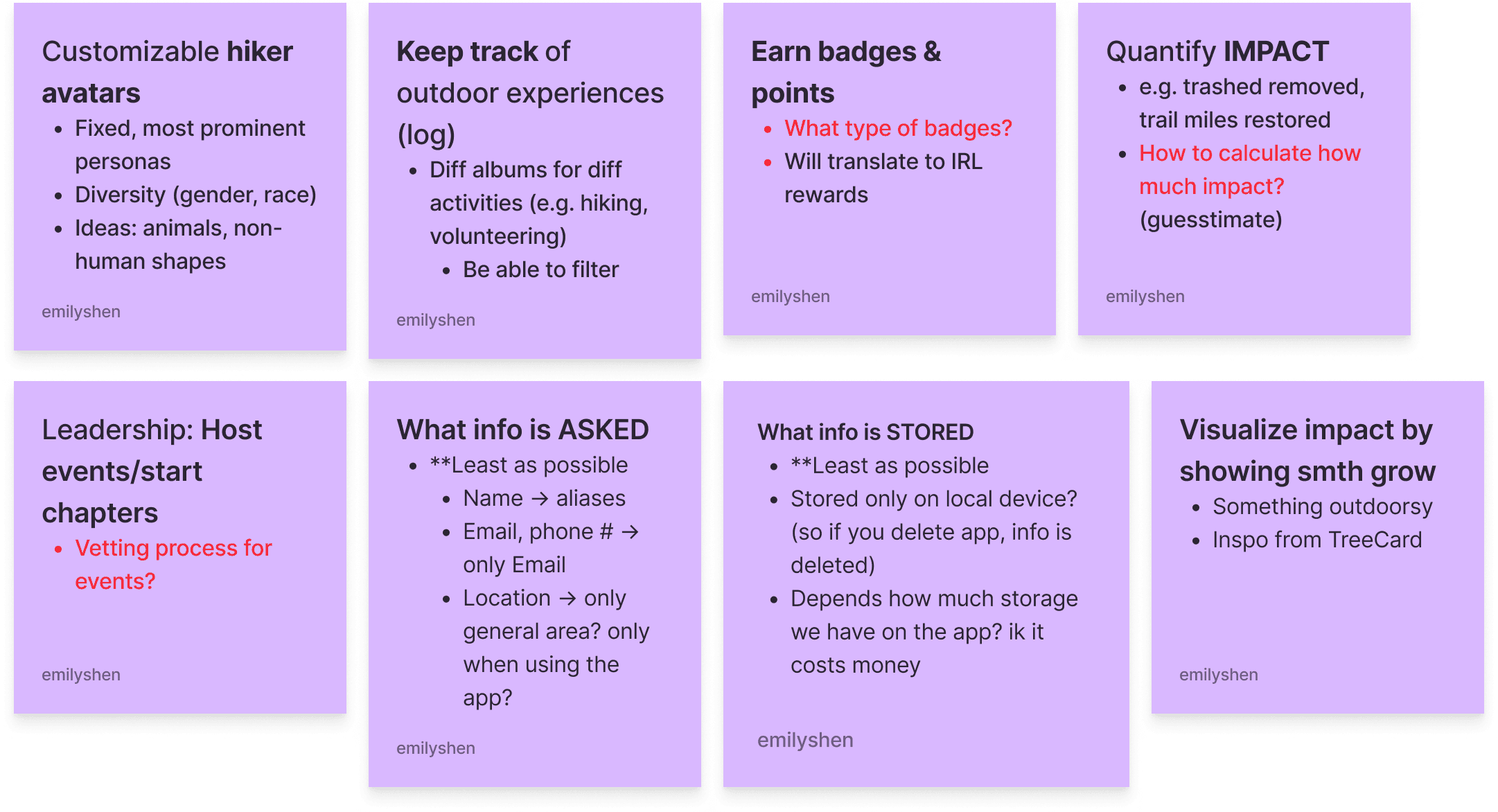
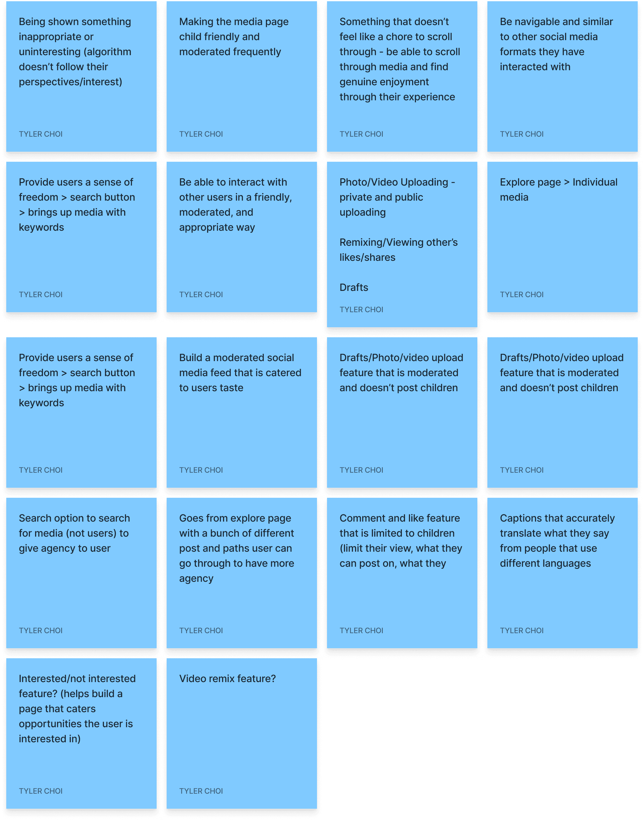
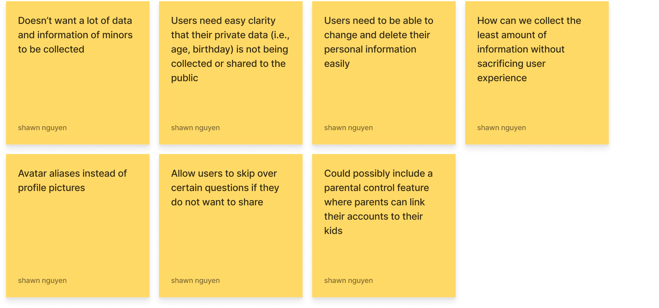
By mapping out opportunities across four key areas of the app (events page, profile, social media, and onboarding), our team was able to decipher what user needs and pain points need to be addressed in each area.
V1 DESIGN DECISION #1
Usability testing in low-fidelity with 6 stakeholders
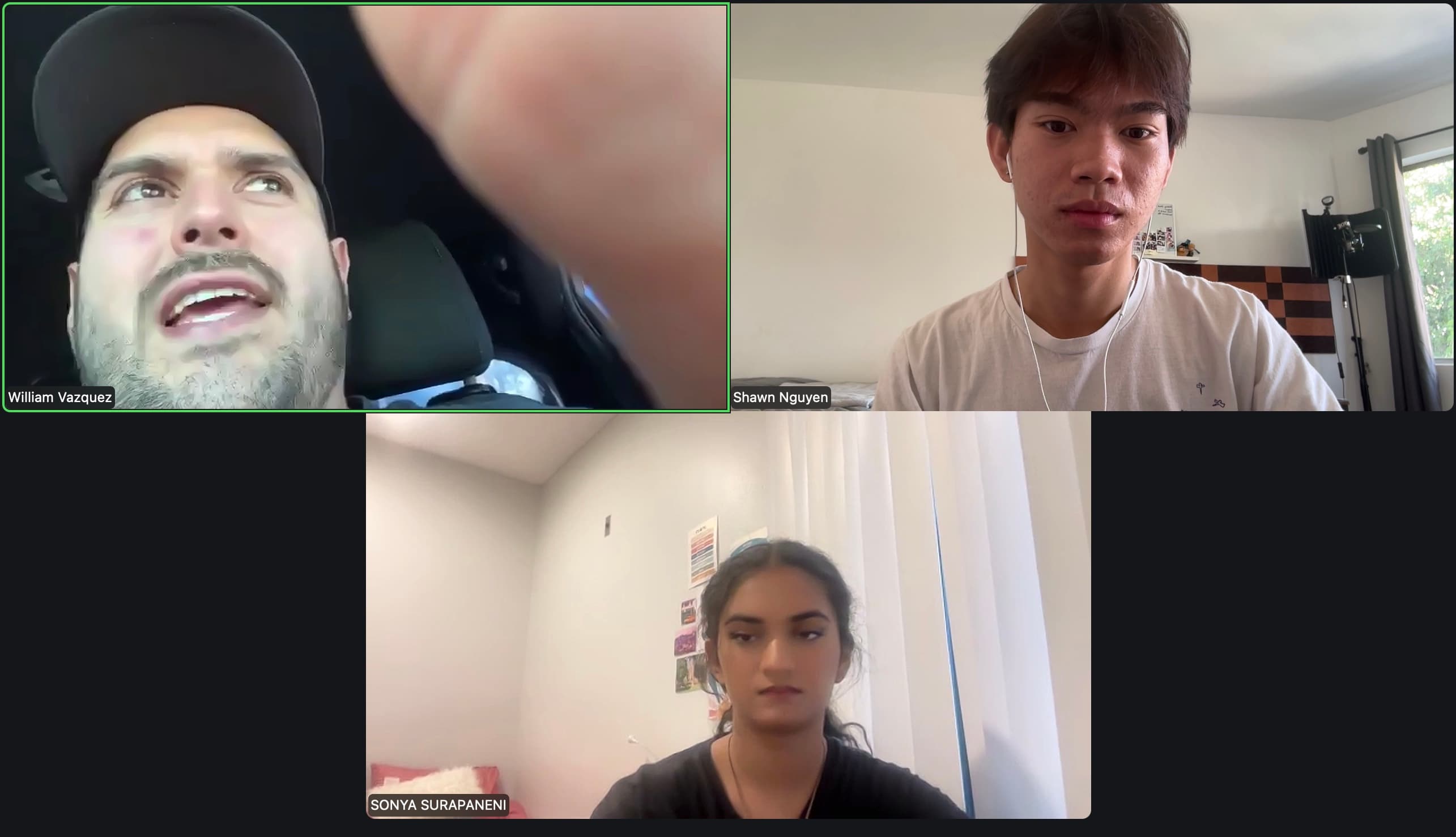
We brought lofi prototypes to stakeholders within We Explore Earth to test for functionality. Personally, I did 2 interviews, including with the CEO!
A/B Concept Test: what should unsure users do?
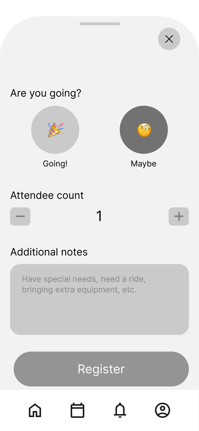
When a user is interested in an event but not ready to commit, should the app let them RSVP as "Maybe" or simply save it for later? These are two distinct mental models, and we needed to know which one felt more natural before building either out.
RSVP as “Maybe”
Save/Bookmark
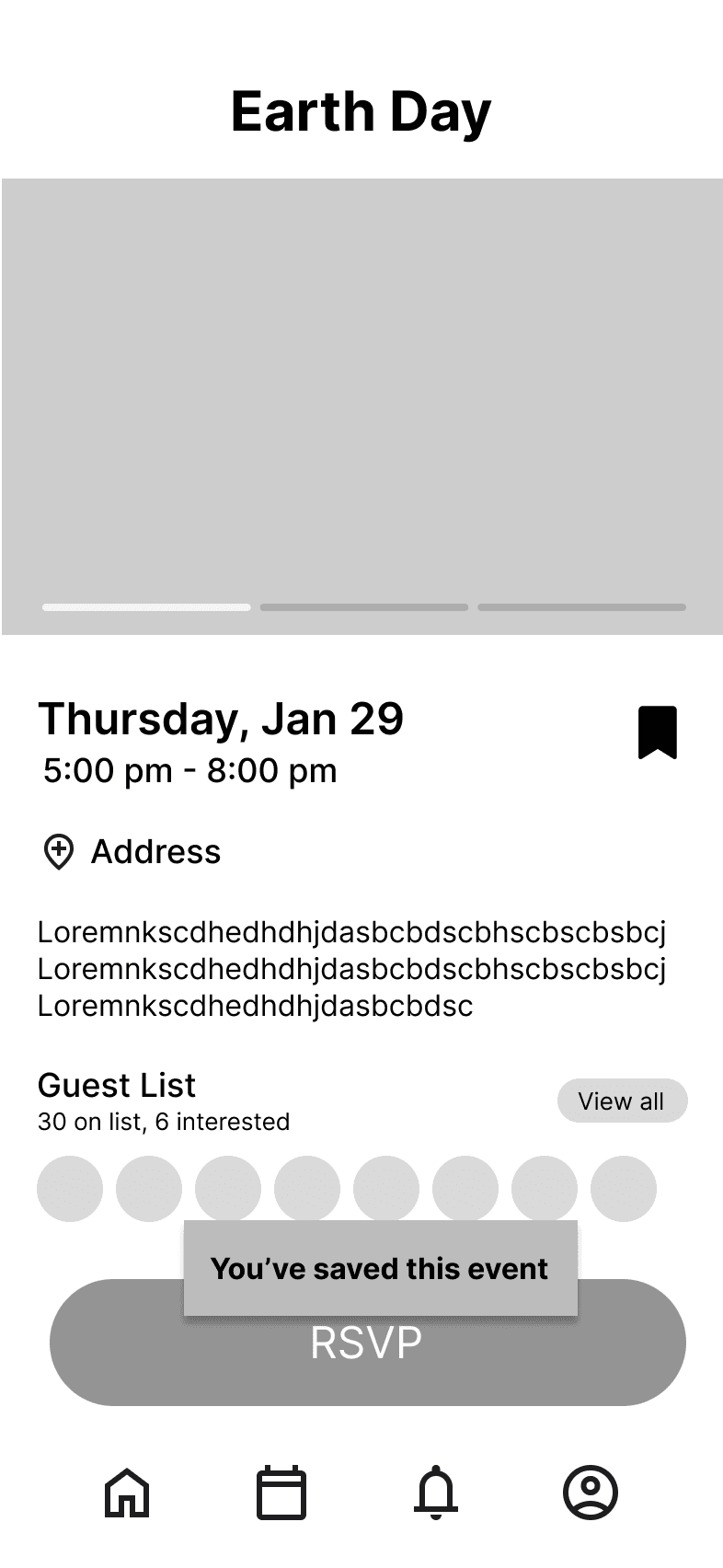
5 out of 6 stakeholders preferred the “Maybe” option


The "Maybe" option felt more intuitive and active, a state users would revisit and eventually convert to a "Yes." However, the "Saved" alternative read as passive, something users would set and forget.
V1 DESIGN DECISION #2
Becoming one with the tribe
We discovered a brand deck the nonprofit had built before our team came on and used it as our foundation, translating its warmth and welcome into the product's visual language.
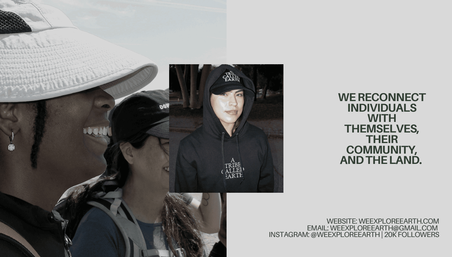
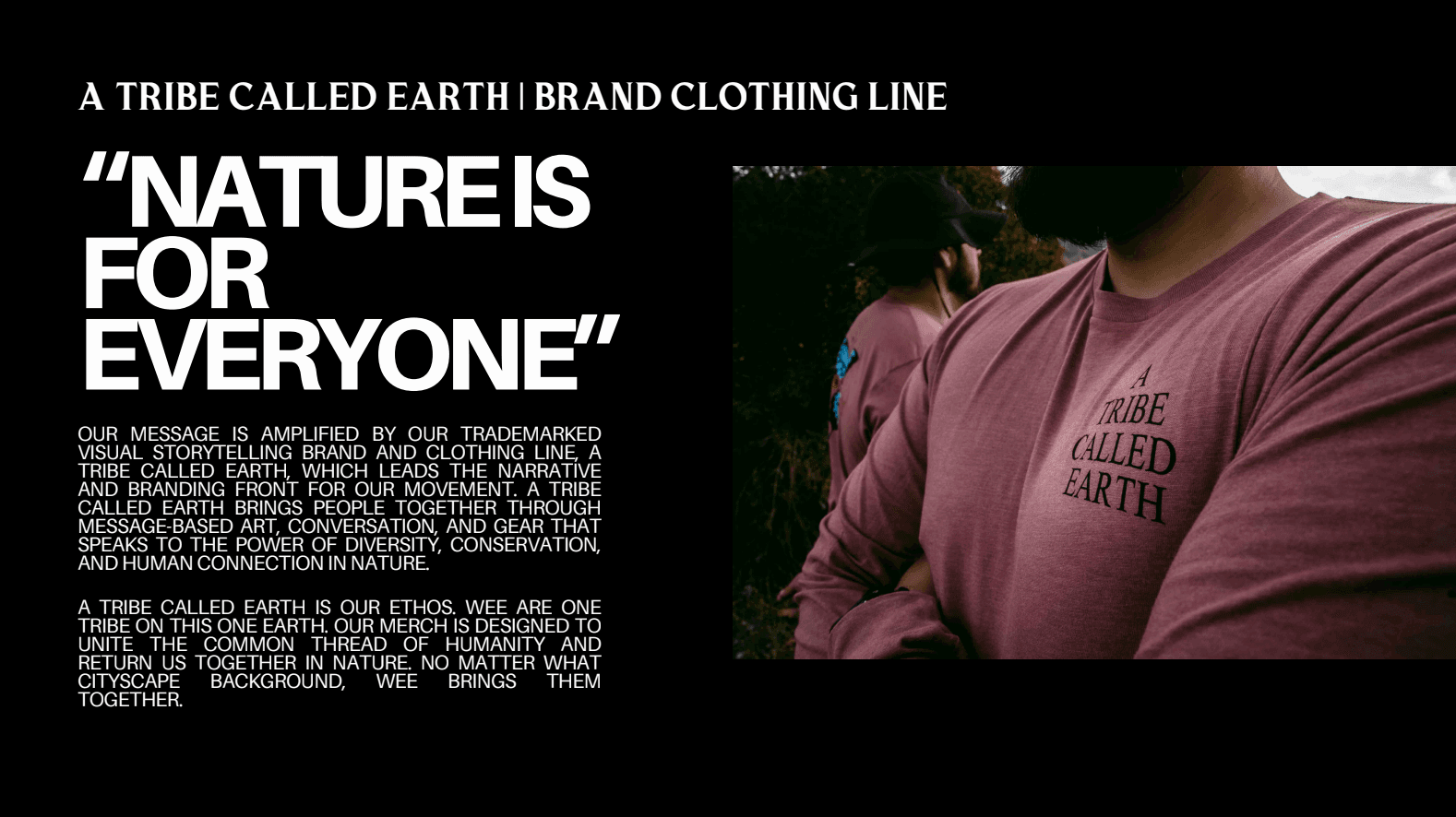
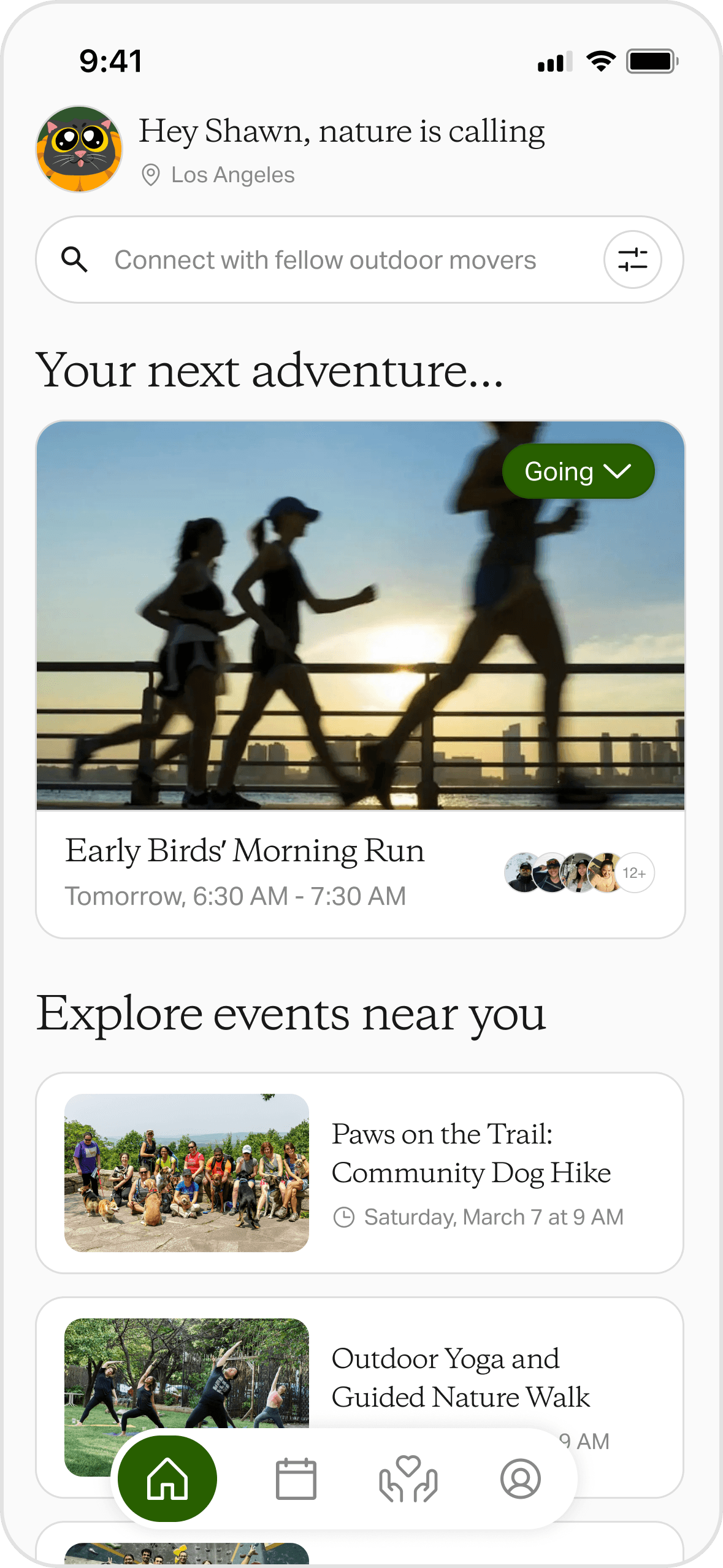
Copy as slight touches of whimsy
Throughout event discovery, playful, intentional copy injects moments of joy, which turns a functional flow into one that builds anticipation.
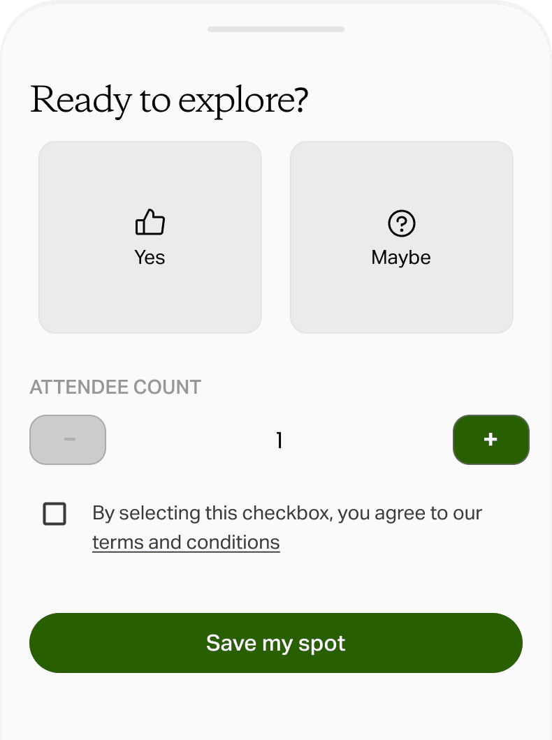
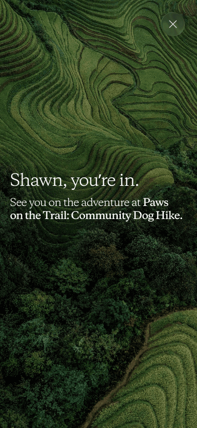
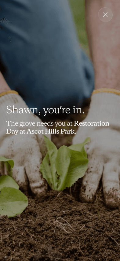
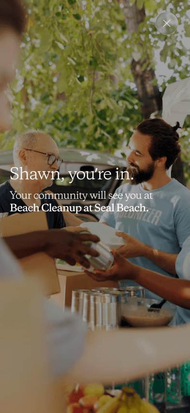
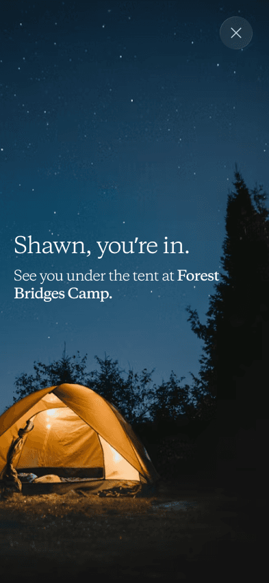
Confirmation screens as an opportunity for delight
Post-registration confirmations are tailored to each event category; four distinct screens, each reinforcing the specific excitement of that event type.
V1 FINAL DESIGNS
Event discovery via filtering
Users can filter through different categories such as date, location, price, and type of event.
Event registration
Users can view important details of an event such as the location, time, and a list of items to bring.
V2 DESIGN EXPLORATION
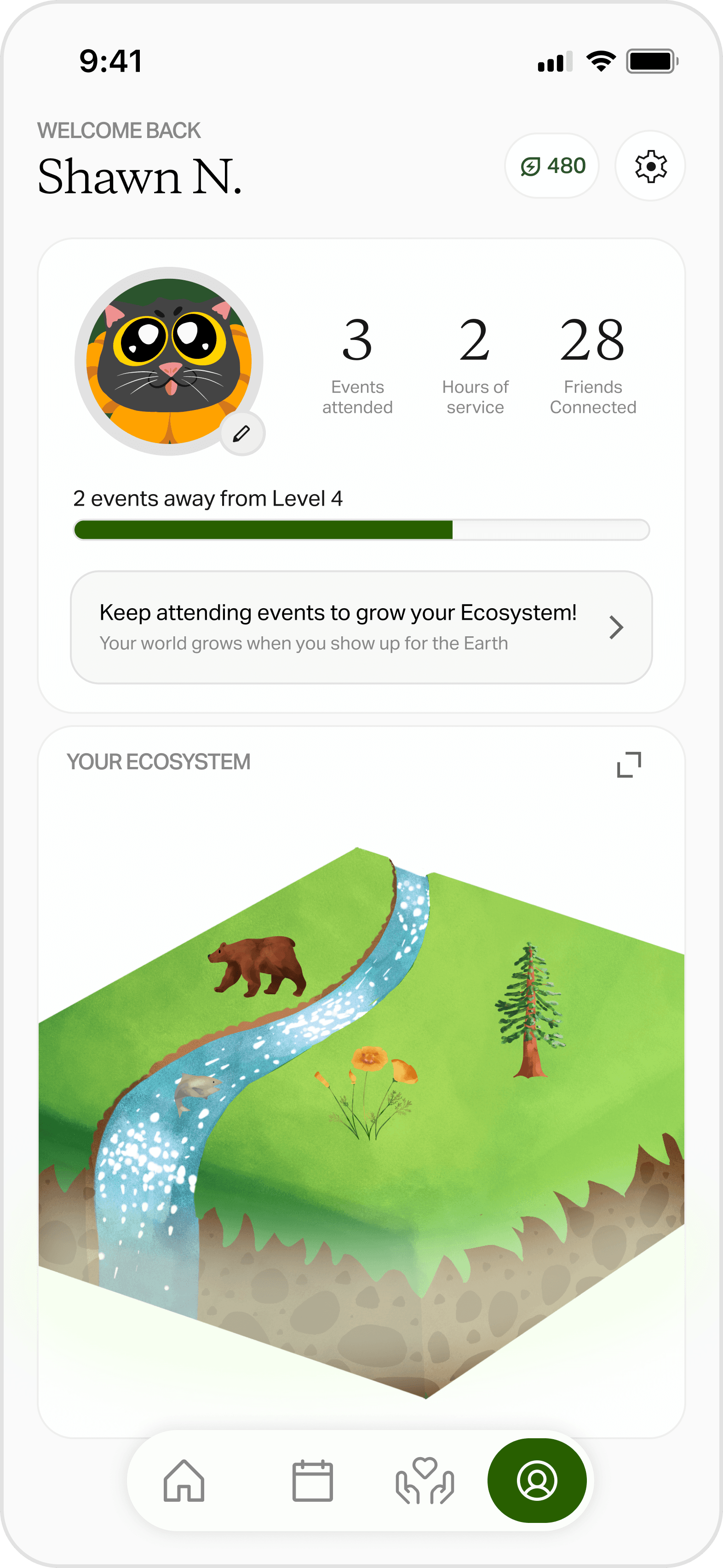
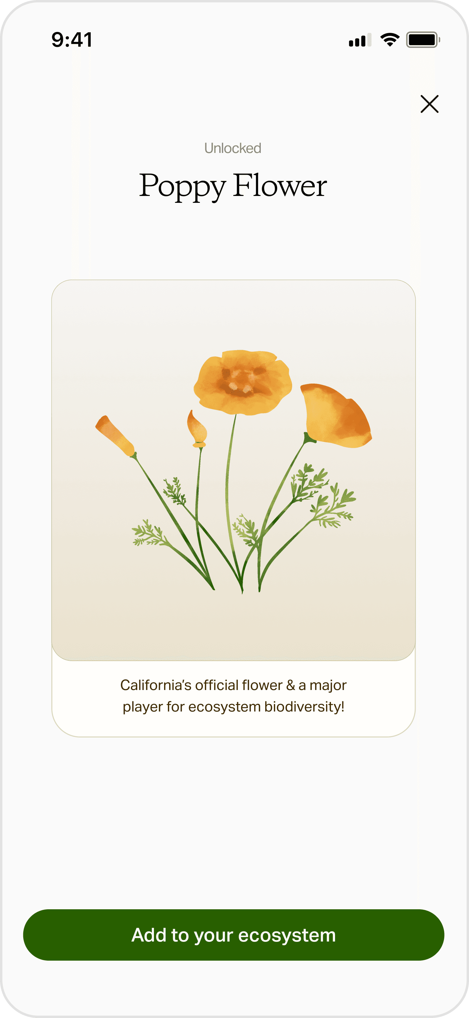
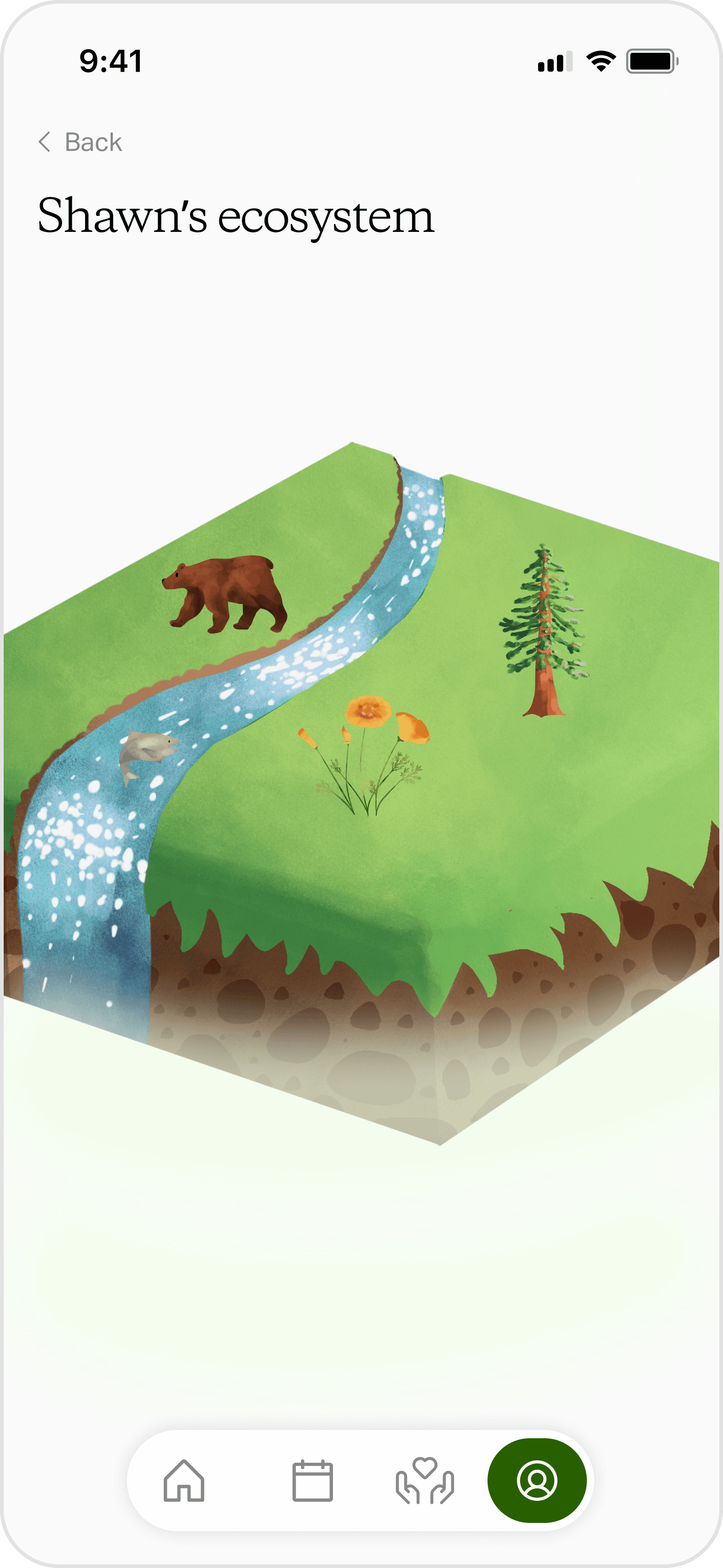
How might we encourage event attendance through gamification?
Users earn XP for attending events. Leveling up unlocks a new element for their personal ecosystem, which turns attendance into progress they can see and build on.
REFLECTION
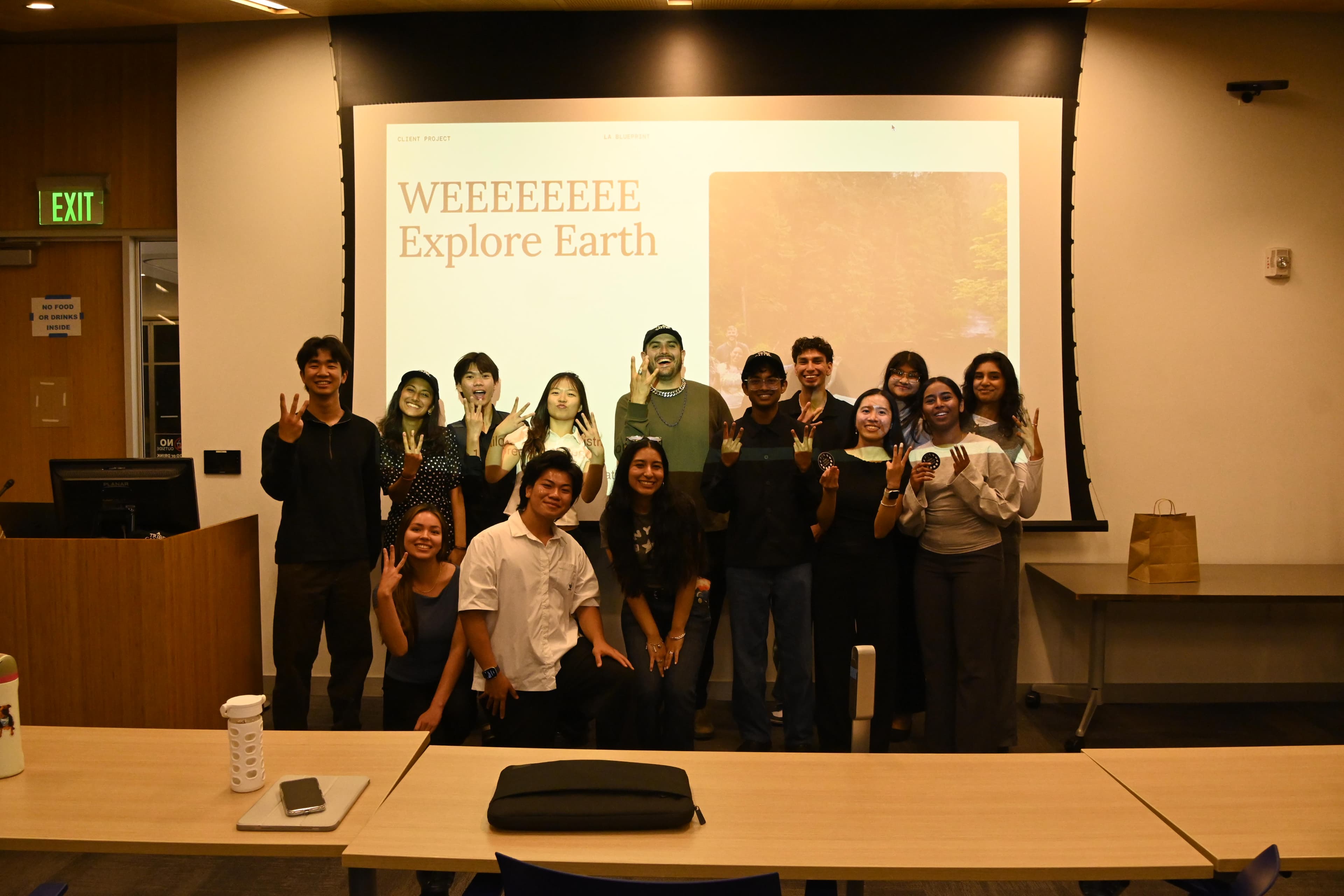
Thank you to our friends at We Explore Earth for trusting us!
We had the opportunity to present our final designs to the We Explore Earth team, capping off months of research, iteration, and close collaboration. V1 designs are now in active development, with our team continuing to support the transition from concept to build.
My biggest takeaways
Designing from 0-1
This was my first project building a product entirely from scratch: collaborating directly with developers and designing every screen needed to bring the app to life. Working at 0-to-1 meant no existing patterns to lean on: every edge case had to be considered and designed for.
Grounding the product in our client’s brand
We drew inspiration from standard event discovery and registration apps, but what sets this product apart is how thoroughly We Explore Earth's brand identity is woven through the entire experience, rather than layered on top of it.